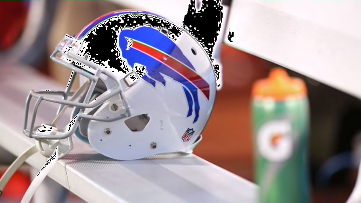
A recent study had fans rank all the logos in the NFL and the Buffalo Bills logo ended up being ranked among the best in the league.
The Buffalo Bills have a great logo and there is some research to support that claim.
A survey was done recently, as explained here on fanjuicer.com, that asked NFL fans to rank the logos used by teams in the league. The article then gets input from a graphic designer to weigh in on the logos.
The Bills came in at No. 7 overall, while the New Orleans Saints topped the list. The Cleveland Browns came in last.
Here is what the graphic designer interviewed in the article had to say about the Bills logo:
"There’s a great organic form of the bison paired with the somewhat unnatural stripe to create the effect of movement. Somehow, it still works. It is definitely one that I can see working in the past as well as now."
The team hasn’t tried to change things up and clearly fans are alright with that. The logo is simple but creative at the same time. One great thing about not making any major changes is that fans can see the logo today and have memories of great Bills seasons from the past when the same logo was all over the field.
That means those home shrines filled with Bills memorabilia don’t need to undergo any major changes.
This team has so much history that I wouldn’t expect any changes to ever be made to the logo. As more time continues to pass, making a change becomes more difficult to do. And no one in Buffalo wants to have the focus go from actual football to things such as a new logo.
Next: Position battles will be the story of training camp in 2018
Having a bad logo isn’t necessarily a big deal, but it is nice to know that your favorite team found something that people like and also something that serves as a symbol for an important part of Buffalo.
